Showing posts with label design. Show all posts

The Difference Between PNG and JPG Image Files

Pin It
PNG vs. JPG image files...
When I was going to school to be a journalist in the early 90s, we didn't learn about digital files. In fact, I took an old-school photography class complete with darkroom developing. My, how times have changed. That said, I had to learn the terminology pretty quickly when I became a journalism teacher and a yearbook and newspaper adviser. The hands-on learning and trial-by-error experience taught me more than any college class could. 

One of the most common questions I get is, "What is the difference between a jpeg and other image files?" Here is a condensed explanation to the difference between PNG and JPG files from a previous summer post found here:

The PNG format makes it possible to knock-out the background (or make it transparent), so your images easily layer on top of one another without the white (or whatever color) background overlapping. You cannot layer JPG (or jpeg) files like this. 

To demonstrate, see the image below. The girl on the left is a JPG file and the girl on the right in a PNG file. When each is placed on a purplish background, the JPG file will maintain its white background. The PNG's is knocked-out, allowing you to place additional PNG files on top of it. 
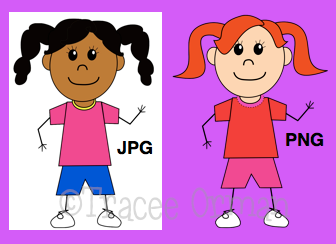
Image file differences: PNG and JPG
Another difference between the two is PNG files never lose their quality.  JPGs, however, will begin to  degrade every time you open them, so over time the quality of the image will not be as sharp. Because of this, PNG files are much larger than JPGs, making JPGs (and GIFs) more ideal for web browsing because they load faster.

I've picked up a lot from teaching journalism and continue to learn as technology keeps advancing. That's an advantage to teaching: it forces us to keep learning and passing along that knowledge. Of course, I learn just as much from my students as they learn from me.

 
If you need help working with images in Microsoft Word (which, in my opinion, is one of the worst programs for design/working with images), you can download this free tutorial. People who use Microsoft and do a lot of designing would probably be better off using Powerpoint or Publisher. 

Since I am a Mac girl, I use the iWork applications (Pages, Keynote) and Adobe's Creative Suites apps: Photoshop and InDesign. Pages is much like InDesign, but much easier, so I have actually converted to using Pages more. If you use a Mac, I highly recommend it!

Designing Your Cover Page - The Rule of Thirds

Photographers know that one way to create an appealing photograph is to follow the "rule of thirds." The rule of thirds is simply breaking up the picture into nine equal parts using two vertical and two horizontal lines. The places where the lines meet are "focal points" and your most important elements should be placed along these lines.

To demonstrate this in photography, see the graphic below. One image naturally follows the rule of thirds and becomes even more visually appealing when it is cropped. The other image is not naturally set up to follow the grid, but after it is cropped, it does become a more interesting picture.

You can use this same principle in design. I use iWork's Pages (Mac) for most of my designs. It is very similar to Adobe's InDesign software, which I used in journalism. You can follow the rule of thirds in any design software, including Microsoft Word. However, using Pages and InDesign make it easier for you to create a grid that you can see, but will not print. In both programs, just place your cursor in the ruler, then hold it down and drag your cursor to the place you want the line. Once you start dragging, a blue line will appear.
Start with a blank document in Pages (or InDesign).

Place your cursor in the ruler, then click and drag it. A blue line will appear. Unclick when the line is where you want it.

To make the horizontal lines, drag from the top ruler.
The lines can always be adjusted by placing your cursor on them and moving them. To get rid of them, just move them right off the page, and they will disappear. (I do not know if Microsoft Word or Powerpoint have the design gridlines feature, but you can always download a template HERE; just be sure to delete it after you've designed your page and before you print, because that one will show up.)
Repeat this step until you have nine equal parts.
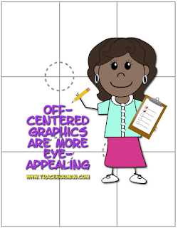
Notice that the four intersections will be places that the viewer's eye is drawn. This is where you want to place your dominant features or elements. Also, following the horizontal or vertical lines with a dominant feature (like the title or a large graphic) will be more eye-appealing.
Many people will be tempted to place a dominant image right in the center of the page. I have been guilty of that, as well. But the more stimulating designs will place a dominant image off-center, following one of the vertical or horizontal lines.
Below are examples of a cover page and a page from one of my Powerpoint presentations that demonstrate the rule of thirds. Notice that the cover page does not have any dynamic images, but because the title is placed on the upper horizontal line, it is more appealing. You can use lighting effects to also draw the viewer's eye to one of the focal points, as demonstrated in the presentation page example.

This does not mean that you should always follow the rule of thirds. But if you are struggling with design and want to try something that will catch the viewer's eye (perhaps make your pages more "pin-worthy" on Pinterest), try this method out and see if it works for you. Good luck!

You can download this tutorial FREE in my teacher store, which includes two gridline .png graphics and additional tips:


Pin It

Need Graphics for Commercial Use?


  Are you looking for affordable graphics, art, images for commercial use? You can find them in my teacher store!

I love designing backgrounds, borders, frames, buttons, and other odds and ends for my own documents. I have a degree in journalism and years of hands-on experience in graphic design. I just recently realized there was a need for commercial-use clip art.

Check out my online store to find graphics that you can use for your personal or professional use. Enjoy!

Similar Posts

Related Posts Plugin for WordPress, Blogger...

Total Pageviews